 Glenn's home page.
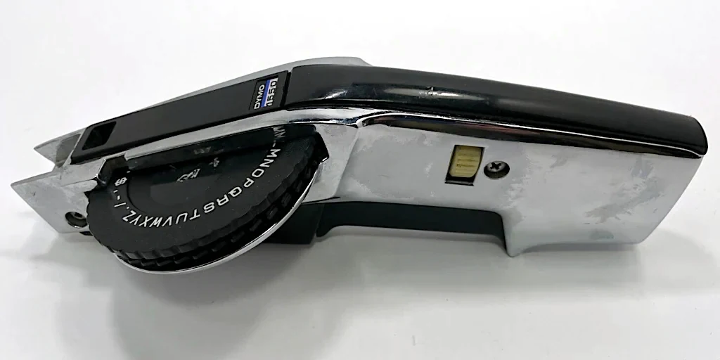
This nifty (and sturdy!) mechanical Dymo 1550 Label Maker was in a box destined for landfill at work. It was far too nice for that fate, so I snagged it:
I don't really need another lable-device for English, as I have a perfectly good modern Brother P-touch Cube Label Maker PT-P300BT, which can print anything I like. I chose that model because there are Linux drivers available in the wild.
So what to do with the Dymo?
Having recently (and finally!) got my hobby artificial language worked out to my satisfaction, I decided to see if I could customise the punch-wheel to make labels in my new alphabet.
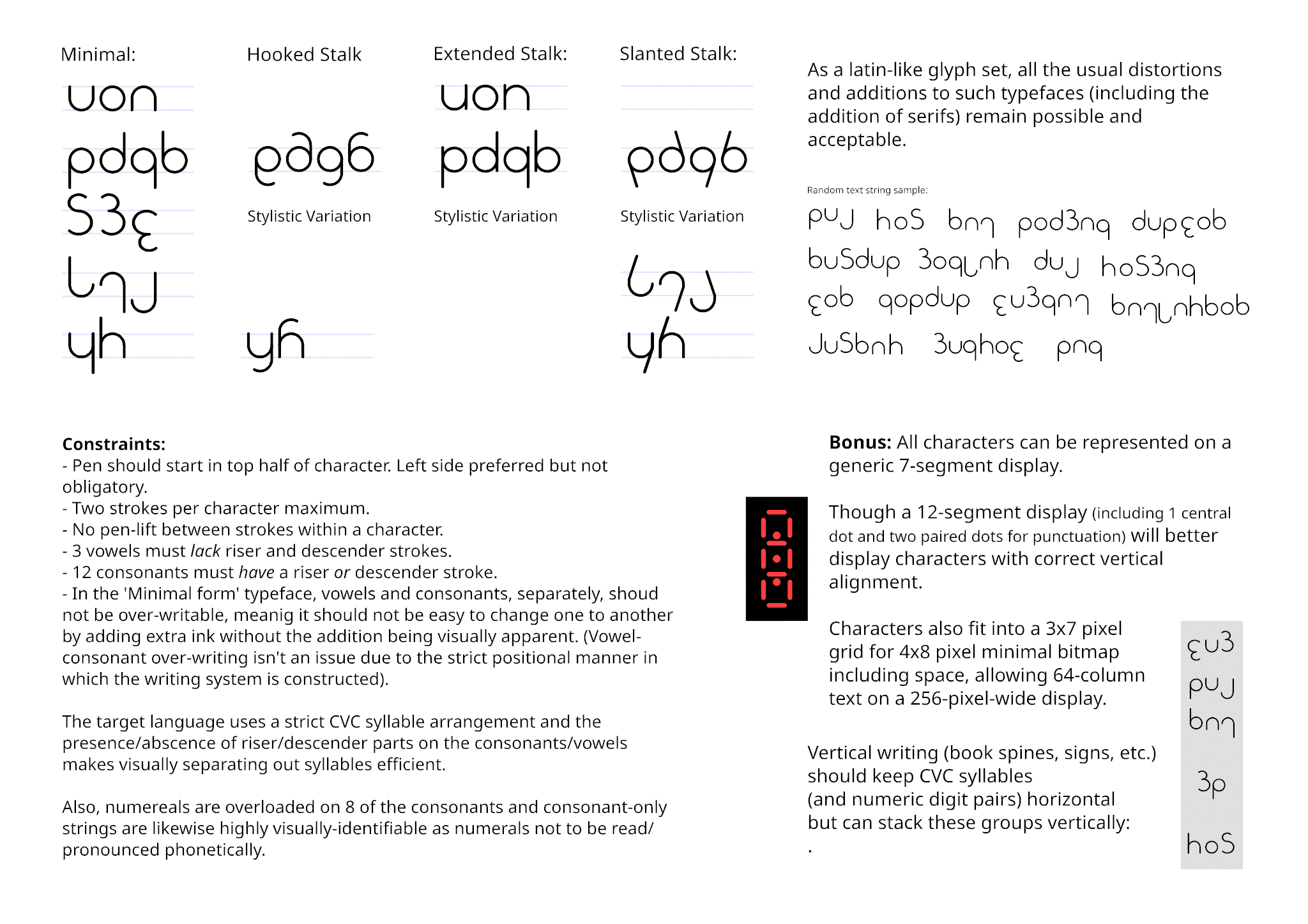
Above is the character set I eventually settled on (after years of mucking about trying all sorts of things!).
The primary characteristics of the alphabet, are:
The come-back is that I have an alphabet (including numerics) of 15 symbols, plus two essential punctuation marks (period, dash) and a few convenience marks (slash, underscore, colon).
There is also, of course, a whole bunch of grammar associated with the language too, not to mention a bit of culture that it has developed since I began alluding to it in a scifi story I occasionally play with writing, but that is out of scope for this project.
The wheel on this device has 47 symbols, though the way in which the mechanism works means that reducing this number, spreading out the hammers a bit more, should work fine. I am planning on 32 symbols, mainly because at 8 per quadrant, it maps well to my numeric-base-8 obscession!
Space, my 15 alpha-numeric glyphs and 5 punctuation symbols would bring the count to 21. I filled the remaining 11 slots with a few extra useful symbols, and some useful/interesting geometric shapes.
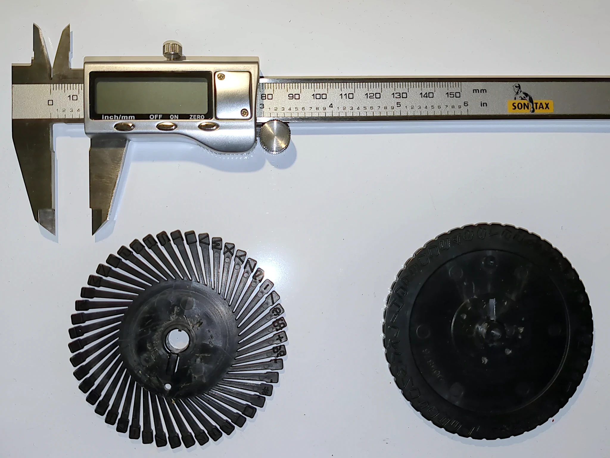
Having (very carefully!) disassembled the device and extracted the origional punch-wheel. My next step was to take my digital calipers and carefully measure all the relevant parts, to re-create them in my 3D modelling program (Blender).
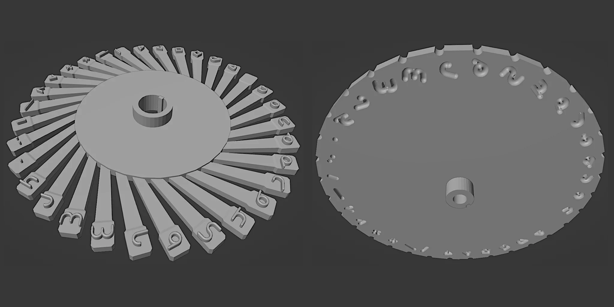
First attempt at creating the model in Blender. Fortunately, my glyphs are constructed from a small number of simple shapes in various configurations.
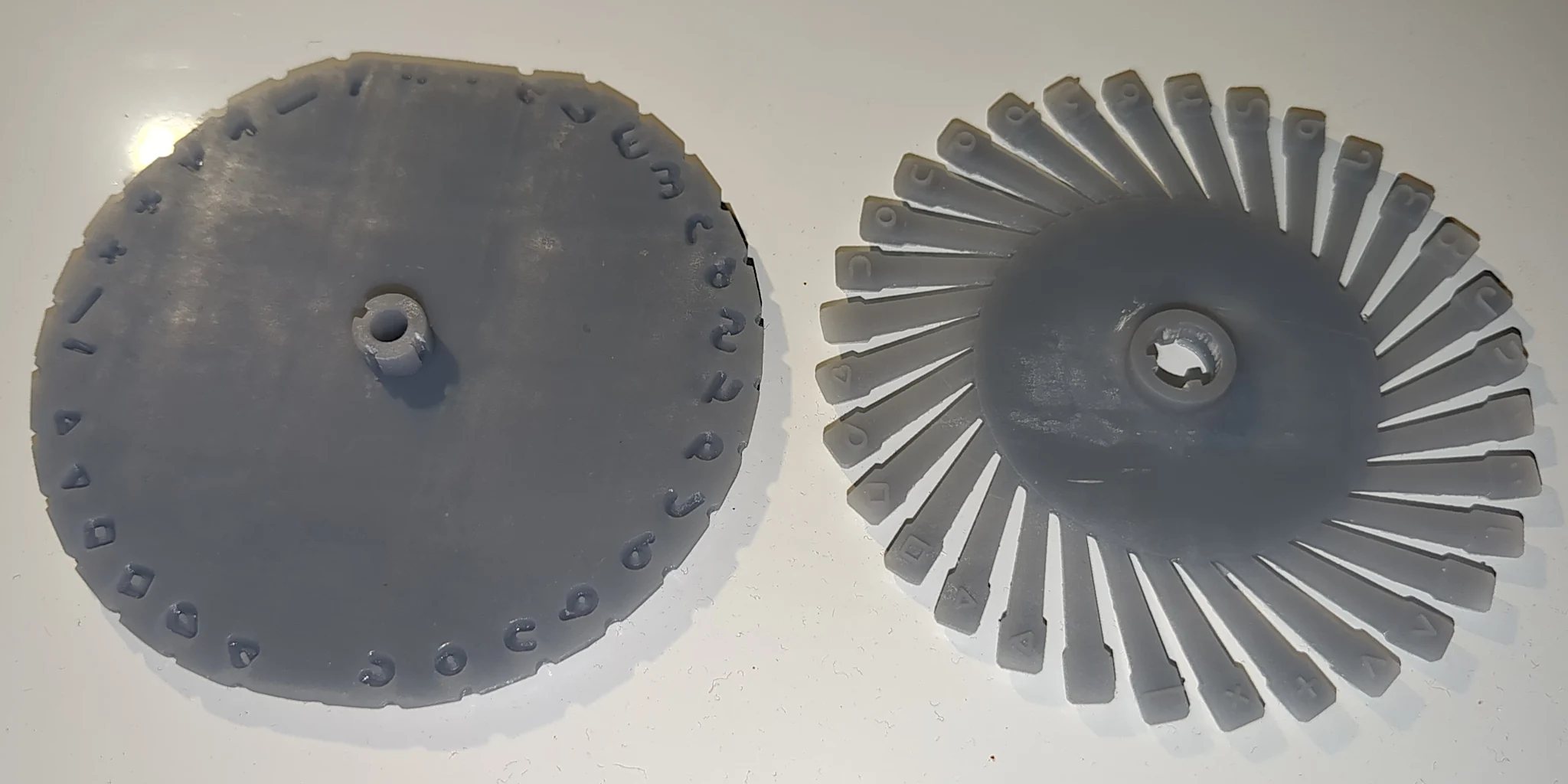
After the third attempt, with some fine-tuning from visually-apparent issues after each print-attempt was done, I got what appears to be a valid wheel-set out of the resin printer.
The print is slightly truncated on two edges as the resin printer at work isn't quite big enough, but this will be perfectly fine for testing fit and function. Fortunately, I managed to orient the wheel so the space, period and colon were on the truncated edges, so I barely got away with it due to these characters having non-punch area where they were cropped. It would be nice to claim I am really clever and planned this all along, but it was just serendipity.
After several further attempts, I have been unable to get a print of the hammer wheel that I could separate from its supports in a single piece without something breaking. But I did get enough part-functional pieces to verify that everything fits together properly and the hammers properly align with the indents in the top wheel. I have enough confidence with the model now to go ahead with trying a professional print in nylon for a (hopefully) final part. (One more 'final' print to get it just-right is still an acceptable possibility, though).
I ordered a set from everybody's favourite tech-hobbiest video-content sponsor, PCB-Way, who I have never used for 3D print before but have had a number of actual PCBs done, and was very happy with both service and results. (Happy enough they don't even have to pay me to say that!) All-up about $AU35 for both parts and shipping.

The print process printed a few fractions of a milimeter bigger than my domestic process (unavoidable with a change of material and print process), but with a litte time and some needle files, I got all the pieces to fit together.
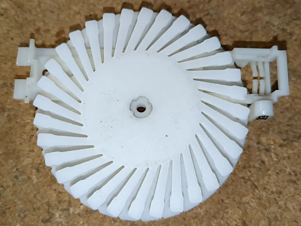
It was a bit fiddly, but I got it all back together. I was honestly not really expecting it to work first attempt here, but it did!
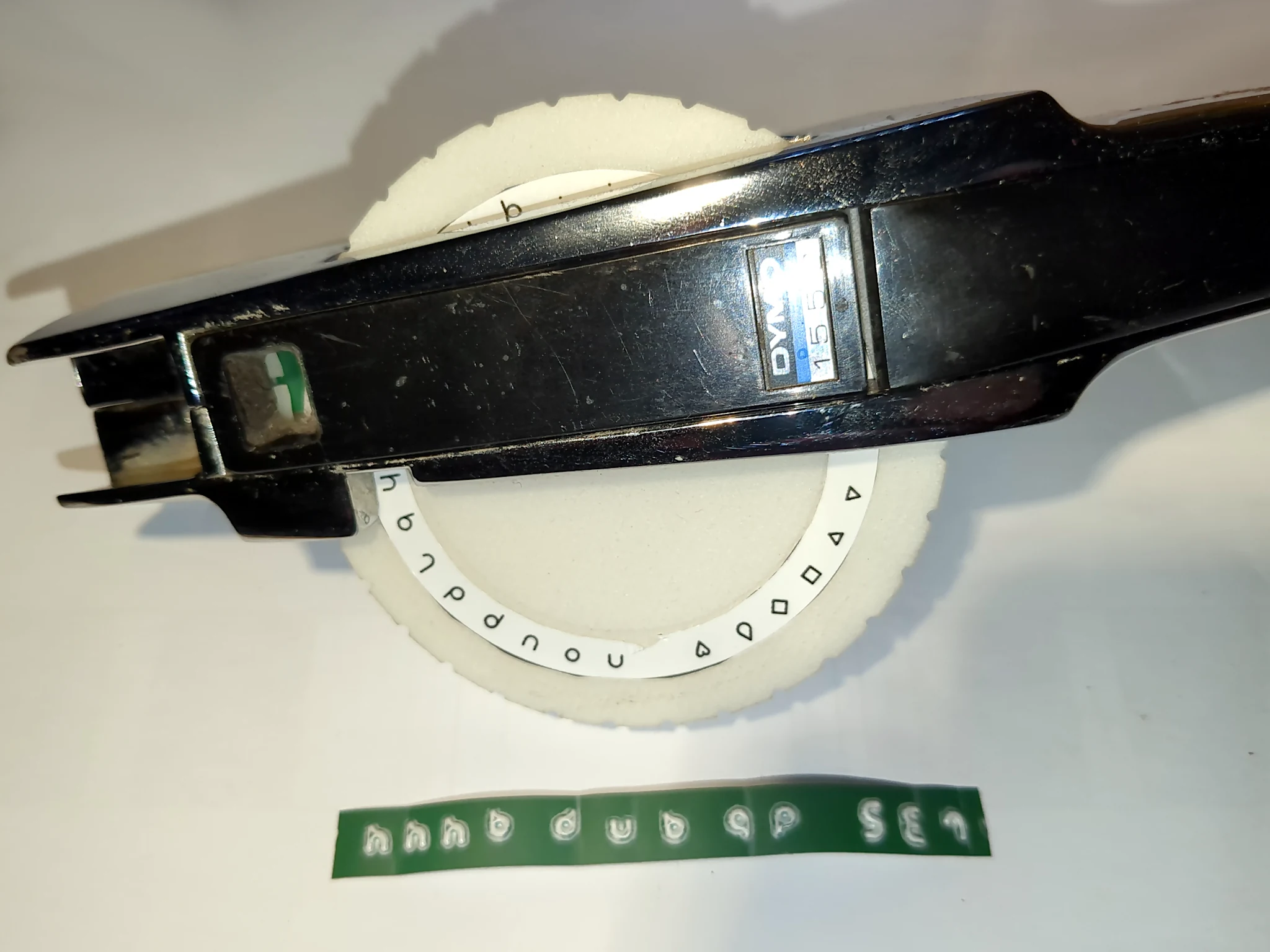
And a laser-printed vinyl sticker so I can actually see what letter is going to be stamped.
The whole device needs a bit of lubrication (don't we all these days!) but I'm going to call this a win.
Ideally I would want to reduce the feed-through rate on the tape as my alphabet is inherenely narrower than the Latin typeface used by Dymo, mainly because I deliberately eschewed high-width shapes like M and W. But that is probably a bit outside of the level of effort I want to put in for now. It would require redsigning the feed-ratchet wheel, which is a bit fiddly to do.
Fun fact: one of my criteria for the alphabet was that text could legibly (if blockily) be rendered in a 3x7 pixel matrix, for 4x8 characters, in turn allowing 64-column text on a 256-pixel-wide display.
And for the true massochists amongst you, here is the Blender file. It is provided to the public domain as-is without warranty or offers to assist with alteration to your own needs. You likely won't want my custom alphabet, but feel free to pick it apart to see how I did it and modify to your sweet little heart's content.